Following on from our usability sessions, we ran a design jam for Aristotle at ThinkPlace in Canberra. Before the jam, I got to watch some feedback videos of the usability sessions that had been conducted a few weeks before. (see the Usability Sessions blog post for more details) During the usability sessions, volunteers were asked to go over the Aristotle website and follow some steps for creating content in the demo server. They were asked to give honest feedback on how they felt about the experience, and because of this feedback a design jam was held. There was a lot of feedback that was very useful concerning user experience and appeal of the websites.
At ThinkPlace we got started right off the bat, discussing what the insights were from the usability sessions and what Aristotle needs to be a good product now, and in the future. So, we listed out what we want people to say about Aristotle and what it should be known for.
We decided that people should think Aristotle was easy to use, friendly, innovative, smart, and credible.
The question then was how do we get people to say these things about Aristotle?
People are already talking about our product site, aristotlemetadata.com, saying that it is a very nicely designed page and that it is good for selling the product, so what we wanted to go over that day was our demonstration registry.
From the usability feedback, there was a little confusion surrounding our demonstration registry. There were questions on how to use it, what to search for, what you are looking at when you search for something, etc. We wanted to try and fix these things, to help people understand what they are looking at right when they see a metadata registry for the first time. We started small, bringing in suggestions from the usability videos that we thought would be helpful in increasing the usability of a registry. We thought about getting rid of one of the search bars, because all of the participants remarked on how on the front page there were two and they didn’t know which one to use.
There was an introduction of prompts at the bottom of the search bar, to help with the first time user going to a registry and not knowing what to search for. Also condensing the help under the search, and the bottom of the page, because even though all of the information is there to be helpful it can introduce a problem to the user without them first running into the problem in the first place.
For the help, we decided to condense it into three different columns so a new user isn’t overwhelmed by information, adding to the ease of use, and we needed to make the voice of the product clear. An example of not having a clear voice for the product would be when going to the main page and then clicking onto the demonstration registry to try it out, you have to question whether the two pages are selling the same product because they look so different.

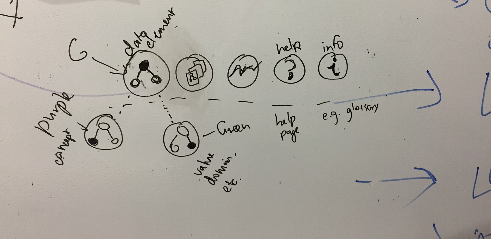
When searching in the registry there was some questions surrounding the filters under the search bar and at the side of the results. There was a suggestion that the filters should be condensed to a single column, or available in one area of the page. Also, clarifying some of the filters, on what they mean would be useful for users. Another observation by one of the users was that when searching for something (e.g. “urgency”) there were two items at the top of the results, an option for a ‘glossary’ item, and the next a ‘concept’. Both of these have very similar definitions, and there wasn’t easy access to anything that would help you if you didn’t know the difference between the two pieces of metadata.
Something that was brainstormed at the design jam was the idea of icons to group similar metadata types, to give a clear and easy to understand visual way to differentiate results. One of our ideas is guidelines for icons to incorporate into the design of Aristotle so that users could look at the icons and know exactly what the item they are looking and what it would be useful for.

The design jam wrapped up with us coming up with designs for what a new website for a metadata registry might look like. We looked through different color schemes when it was decided that the blue, green and grey color scheme was a little cold and unwelcoming, and opted for a pink, grey and black color scheme instead, an admittedly bolder choice, but shows you what you could have it look like for your potential users, and how much it can change.
The new design incorporates more whitespace so users can navigate with ease. We simplified the help and added links to information for people who might not be familiar with a metadata registry. When searching for metadata, the user will see a new search page with more whitespace between search results and the new icons incorporated in the design.
This is just the beginning of a new design for metadata registries, but we see plenty of opportunity to improve how people interact with metadata. We are always looking for feedback, so tell us what you would like to see incorporated in the next iteration of our designs below.